top of page

Case study
MPOE
High-end movie theater


Project overview
The product
MPOE is a website that allows users to preview movies and order tickets. The users are between 20-45 years old. Most of them are movie lovers. The goal is to see whether the flow is easy, fast for all users.
Project duration
December 2021 to February 2022
My role
UX designer leading the movie website design
The problem
Available movie websites are complicated with overwhelming information and unnecessary steps of checkout.
The goal
Design a movie website that can be user-friendly by providing clear navigation and order process.
Responsibilities
Conducting interviews, paper and digital wireframing, low and high-fidelity prototyping, conducting usability studies, accounting for accessibility, iterating on designs, and responsive design.
Understanding the user
User research summary
I conducted user interviews, which I then turned into empathy maps to better understand the target user and their needs. I discovered that many target users are sensitive about the presence of the design and would like clear navigation. They don’t like many advertisements and care about money and time.
Pain point
1. Movie websites often have too many advertisements
2. Watch a movie on phone is not good for the eyes
3. The websites often contain too many information so it seems not clear and clean
Persona: Lane
Problem statement
Lane is a busy music performer, who needs to preview movies before buying tickets
because she doesn’t want to waste money and time.
User journey map
I created a user journey map of Lane’s experience using the site to help identify possible pain points and improvement opportunities.


Starting the design process
Sitemap
The unclear navigation leads to a better experience of a site, so I used that knowledge to create a sitemap.
My goal here was to make strategic information architecture decisions that would improve overall website navigation. I choose this structure to make the navigation easy and clear.

Paper wireframes
Next, I sketched out paper wireframes for each screen in my app, keeping the user's pain points about navigation, browsing, and checkout flow in mind.
The home screen paper wireframe variations to the right focus on optimizing the browsing experience for users.


Paper wireframe screen size variation(s)
Because the movie website access the site on a variety of different devices, I started to work on designs for additional screen sizes to make sure the site would be fully responsive.

Digital wireframes
Moving from paper to digital wireframes made it easy to understand how the redesign could help address user pain points and improve the user experience.
Prioritizing the search bar for users to navigate easily is my key part of the design.
Easy access to the movie preview page

Easy navigation bar
Digital wireframe screen size variation(s)
My goal is to make the website as clear as possible for user flow.


Low-fidelity prototype
To create a low-fidelity prototype, I connected all of the screens involved in the primary user flow of adding an item to the cart and checking out.
At this point, I had received feedback on my designs from members of my team about things like placement of buttons and page organization. I made sure to listen to their feedback, and I implemented several suggestions in places that addressed user pain points.

View the MPOE
Usability study : Parameter
Study type
Unmoderated usability study
Location
China, remote
Participants
4 participants
Length
20-30 minutes
Usability study : Findings
I found that the most important thing for users is clear navigation and interaction.
Saved
There is no direct saved sign-on website so they have to go to the account to check
Cart
There is no add to cart button on the front page
Account
During the checkout process, there wasn’t a clear way for users to log in to their account to pre-fill previous billing and shipping info
Refining the design
Mockups
Users can add the movie to cart directly on front page.
Before usability study
After usability study


Users can see whether they have saved movies directly on the navbar.
Before usability study
After usability study


Mockups: Original screen size

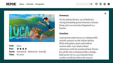


Mockups: Screen size variations
I included considerations for additional screen sizes in my mockups based on my earlier wireframes. Because users shop from a variety of devices, I felt it was important to optimize the browsing experience for a range of device sizes, such as mobile and tablet so users have the smoothest experience possible.


High-fidelity prototype
My hi-fi prototype followed the same user flow as the lo-fi prototype and included the design changes made after the usability study, as well as several changes suggested by members of my team.

View the MPOE
Accessibility considerations
1. I used headings with different sized text for a clear visual hierarchy
2. I used landmarks to help users navigate the site, including users who rely on assistive technologies
3. I designed the site with alt text available on each page for smooth screen reader access
Going forward
Takeaways
Impact
Our target users shared that the design was intuitive to navigate through, more engaging with the images, and demonstrated a clear visual hierarchy.
What I learned
I learned that even a small design change can have a huge impact on the user experience. The most important takeaway for me is to always focus on the real needs of the user when coming up with design ideas and solutions.
Next steps
1. Conduct follow-up usability testing on the new website
2. Identify any additional areas of need and ideate on new features
3. Add more useful information which would provide a better experience for users
bottom of page